App Planning for Founders From Idea to Working Prototype
Follow a founder-friendly example from a one-paragraph idea to a PRD, feature specifications, user flow, wireframes, and a working prototype.
Hi, we're the Manyfast team.
The planning examples below are translated from our Korean case study.
The final app screens are an English recreation of its design, as explained in the prototype section.
If you have ever thought about starting a business, you may recognize this.
The idea rarely arrives when you are sitting at your desk trying to find one.
It turns up on a walk or in the shower, and suddenly you cannot stop thinking about it.
You write it down. You open an AI chat and keep talking well into the night.
Who would use it? What else exists? How would it make money?
After a few days, you have the beginnings of a business plan, perhaps even a pitch deck.
As the idea develops, smaller decisions appear.
What if there is nothing to recommend? Should the app remember a user's choices when they go back? What can someone do with a shared link?
Those answers tend to end up in different notes and AI conversations.
Then you want a developer, or an AI coding tool, to build the app.
What do you send? Which decisions need to be settled first?
A business plan explains why the business should exist.
Building the product also requires a plan for how it will work.
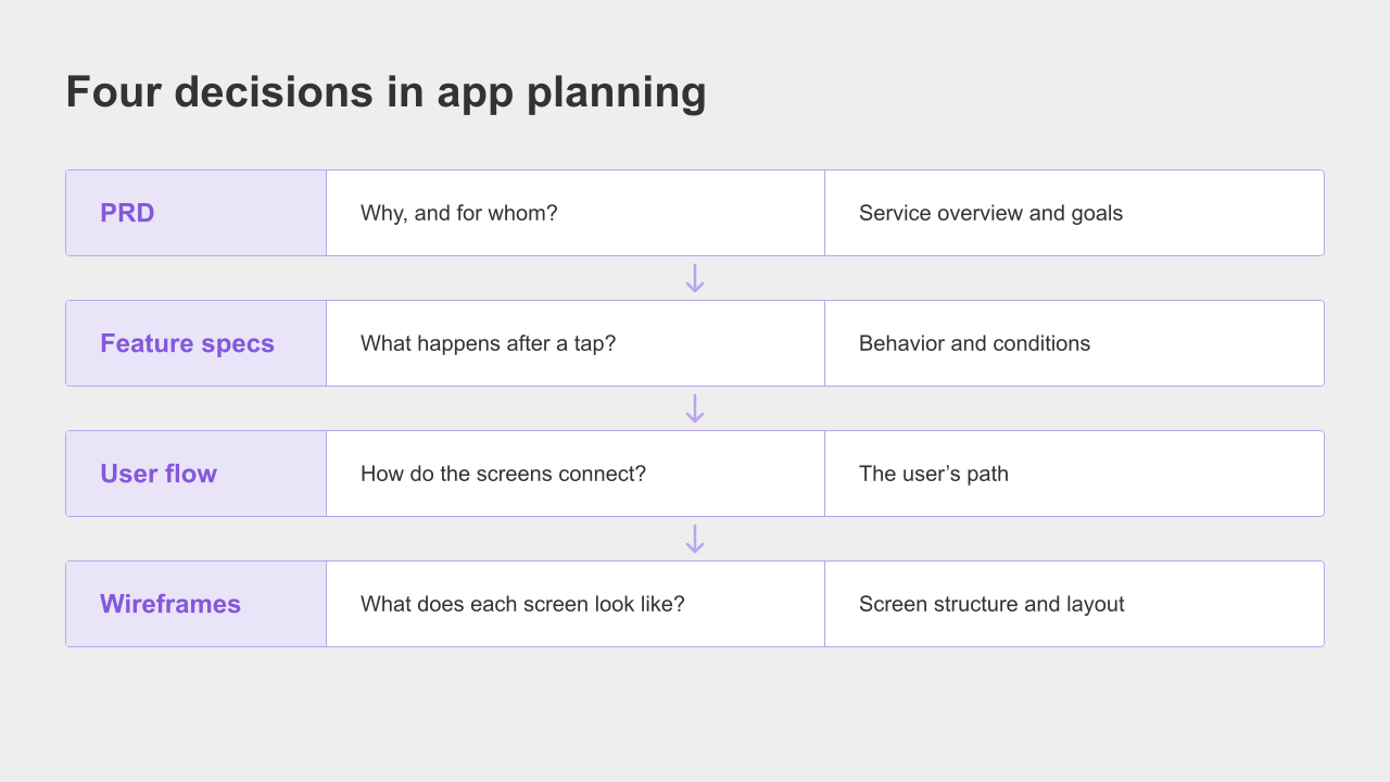
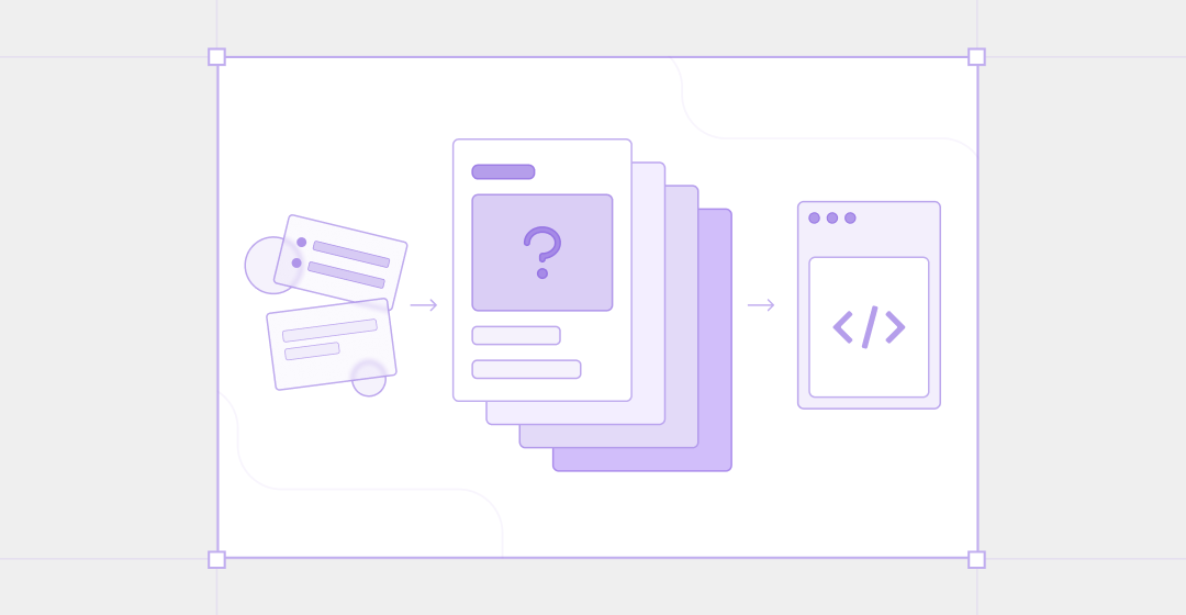
For this example, we used four planning documents to answer four practical questions:
A PRD explains who the product is for and why it is needed.
A feature specification describes what happens when a user takes an action.
A user flow maps the order of steps and screens.
A wireframe shows what belongs on each screen.
Manyfast is a collaborative product planning workspace, rather than a business-plan generator. It helps you prepare the documents you will discuss with a developer or pass to an AI coding tool.
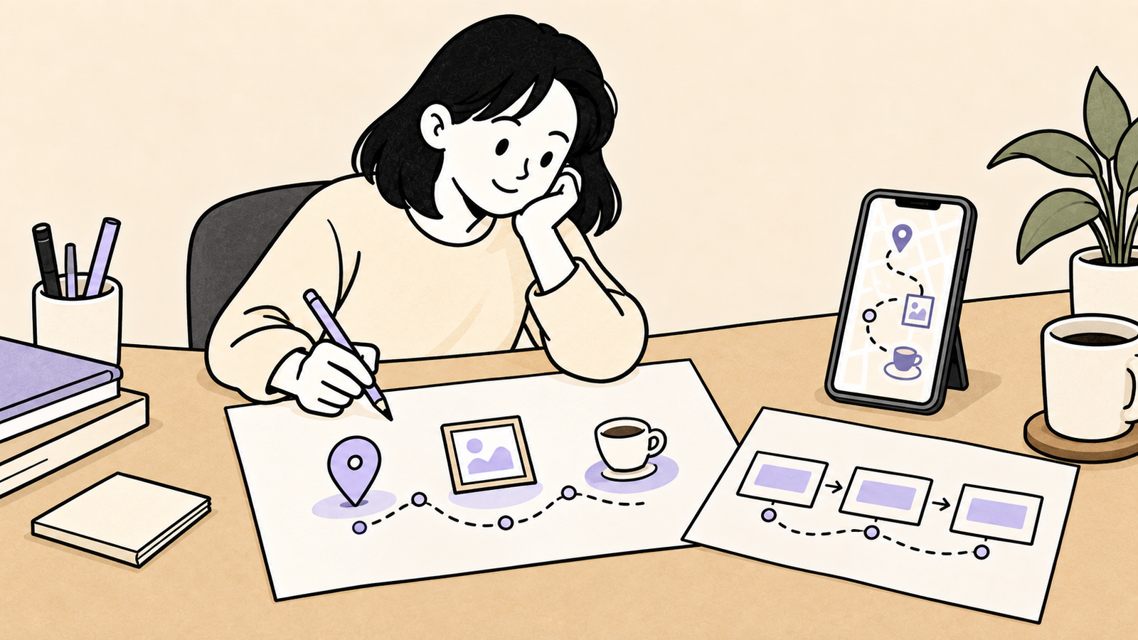
We tried that next step ourselves with a fictional app called “Day Out.” It recommends an itinerary combining nearby exhibitions and cafés. If you are a first-time founder or building on your own, the same process can help you turn an idea into something you can show and test.
The PRD started with one paragraph
A PRD is a Product Requirements Document. It sets out what you want to build, who it is for, and why.
The feature specifications and screens that follow use it as their starting point.
If you already have a service overview in your business plan, you do not have to start again with an empty template.
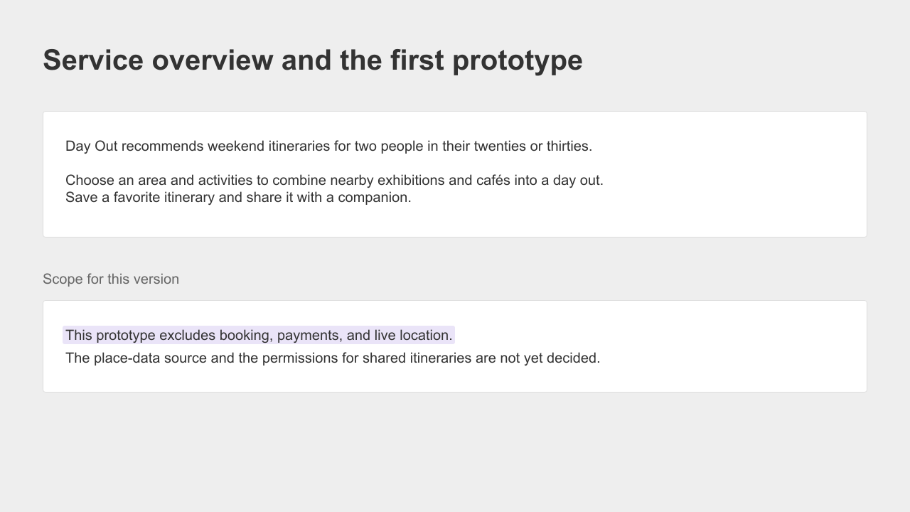
We pasted this paragraph into Manyfast's AI assistant, Manny:
Day Out is an itinerary recommendation service for two people in their twenties or thirties planning a weekend date or outing.
Users choose an area and the activities they are interested in.
The app combines nearby exhibitions and cafés into a day out.
Users can save an itinerary they like and share it with their companion.
We added two sentences to make the scope and open decisions clear:
Leave booking, payments, and live location tracking out of this version.
We have not yet decided where the place data will come from or what a person receiving a shared itinerary will be allowed to do.
We did not intend to build everything at once.
We wanted to find out whether a suggested itinerary looked appealing enough to try.
We also wanted the undecided parts to stay visible.
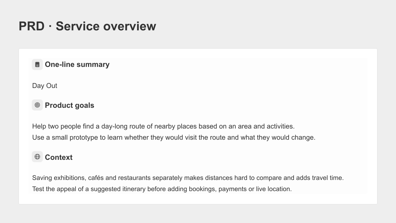
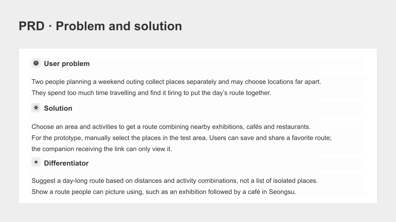
Manny produced a PRD draft. It organized the problem and proposed solution, target users, scenarios, possible prototype metrics, and risks.
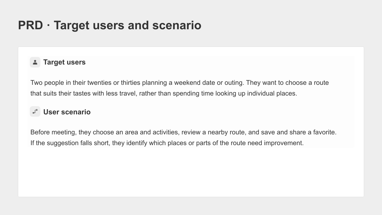
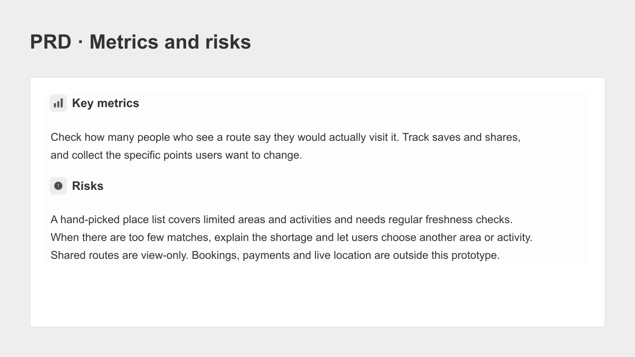
Two details stood out. The draft suggested measuring how often people saved or shared an itinerary.
We kept that as a possible measure for later user testing, not as a result we had already achieved.
It also proposed answers for the place-data source and sharing permissions, even though we had said they were undecided.
Those were choices for us to make. In the next step, Manny brought them back as questions.
The feature specification settled what happens when places are missing
Once we had a reason to build the app and an intended audience, we moved to the feature specification.
This describes what the app should do when someone presses a button, including the cases where the expected result is unavailable.
Manny asked about our two open decisions and raised another: what should happen if there are not enough places matching the user's choices?
Someone wants to see an exhibition today, but we have nothing suitable to recommend.
That is easy to miss while writing a business plan. It is also the sort of question a developer would ask before implementing the feature.
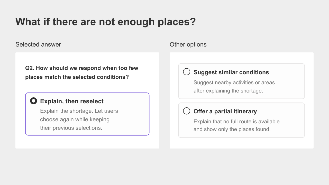
There were three options: explain the shortage and let the user choose again, suggest similar conditions, or show whatever places were available.
We briefly considered suggesting alternatives. But if someone chose Seongsu, a neighborhood in Seoul, sending them to a different area would undermine that choice.
We decided to explain that no matching itinerary was available and let them change their selections.
We also settled the other questions. Instead of connecting an external map service, we would use places we selected ourselves.
The first prototype would contain a few sample exhibitions and cafés in Seongsu. A person receiving a shared itinerary would be able to view it, but not edit it.
Those answers became rules in the feature specification. The document gives a developer something to implement and gives us something to check after the work is done.
Reading the rules raised one more question. If someone returns from the “no itinerary available” screen, do they have to choose the area and activities again?
We decided the app should keep their previous choices, and asked Manny to add that condition.
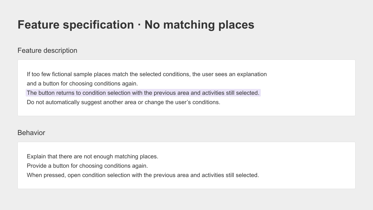
We had turned open questions into specific behavior. Next, we wanted to see the path a user would take.
User flows and wireframes showed both outcomes
A user flow maps how someone moves through an app.
It shows the sequence you would otherwise have to explain as “this screen, then that screen.”
After “Request an itinerary,” our flow split at “Is a matching itinerary available?”
If yes, the user went to the results screen. If not, they saw the shortage message.
Choosing to change their selections brought them back to the selection screen.
The decision we had just made was now a visible branch.
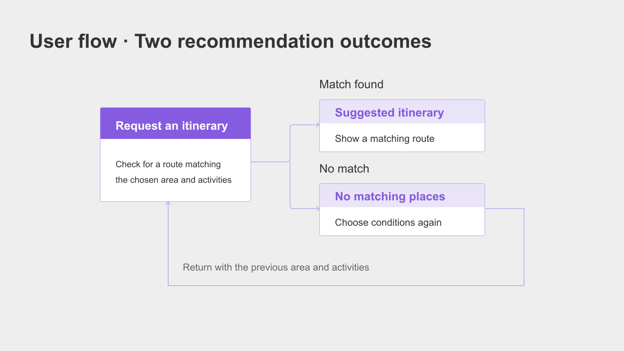
The wider flow also contained saved itineraries and sharing.
For the first set of screens, we narrowed the scope to three: selection, recommended itinerary, and no matching itinerary.
We wanted to inspect the request-and-result experience before adding more.
We generated wireframes for those screens. A wireframe is a rough layout showing where information, buttons, and messages belong, before final visual design.
It lets a designer and developer discuss the same screen.
“Explain that there are not enough places” became a visible heading, “No itinerary available,” with a button to return to the selections.
We now had one flow and three screen layouts to review.
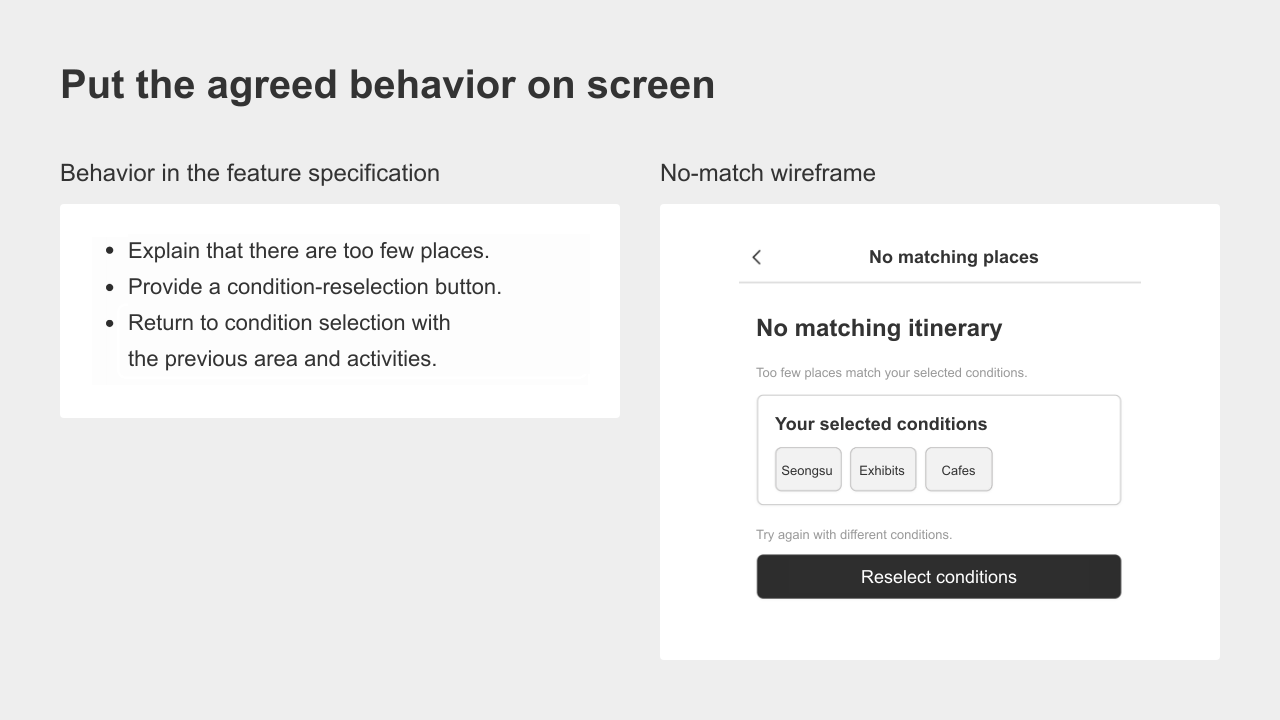
The next step was to make those screens work.
We made a deliberately smaller prototype
At this point, you can hand the planning documents and a clear implementation request to a developer or an AI coding tool. The first build does not have to include every feature in the plan.
For this English demonstration, we recreated the approved Korean app design in HTML and CSS with Codex, translated the interface, and added local sample behavior.
The screens below preserve the app design rather than replacing it with the earlier wireframe. This was not a new Claude Code or MCP implementation test.
The plan included saving and sharing, but this prototype covers only choosing conditions, seeing a suggested route, and handling a shortage.
It uses fictional places and has no account system, database connection, live place API, or production recommendation algorithm.
When we selected “Find my route” with sample places available, the app displayed an itinerary of exhibitions and cafés.
The result included a walking-order example; the place information and walking times are illustrative, not real travel guidance.
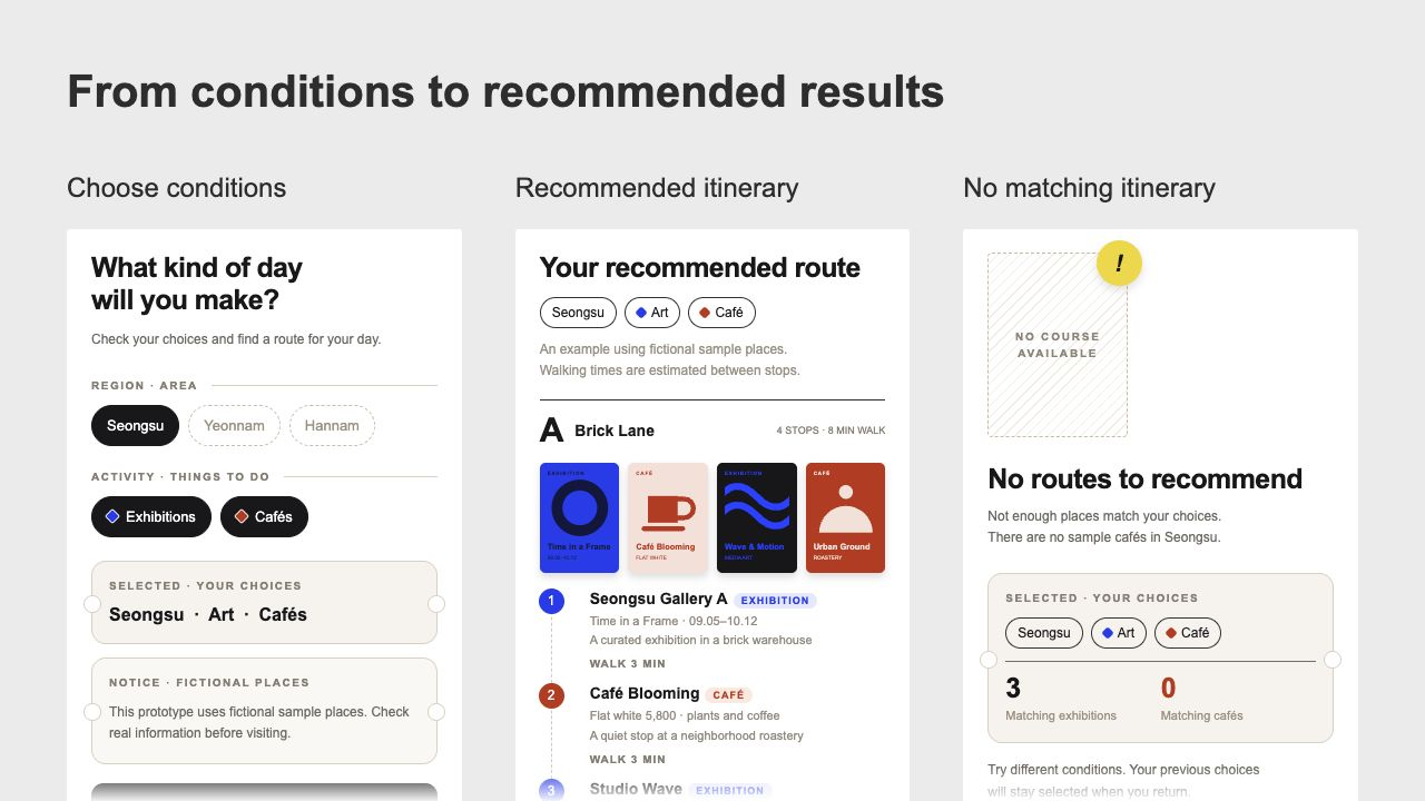
We then switched the sample data to the case without matching cafés. The shortage message appeared. After selecting “Choose conditions again,” Seongsu, exhibitions, and cafés were still selected.
The condition we had recorded in the feature specification was now something we could check by clicking through the prototype.
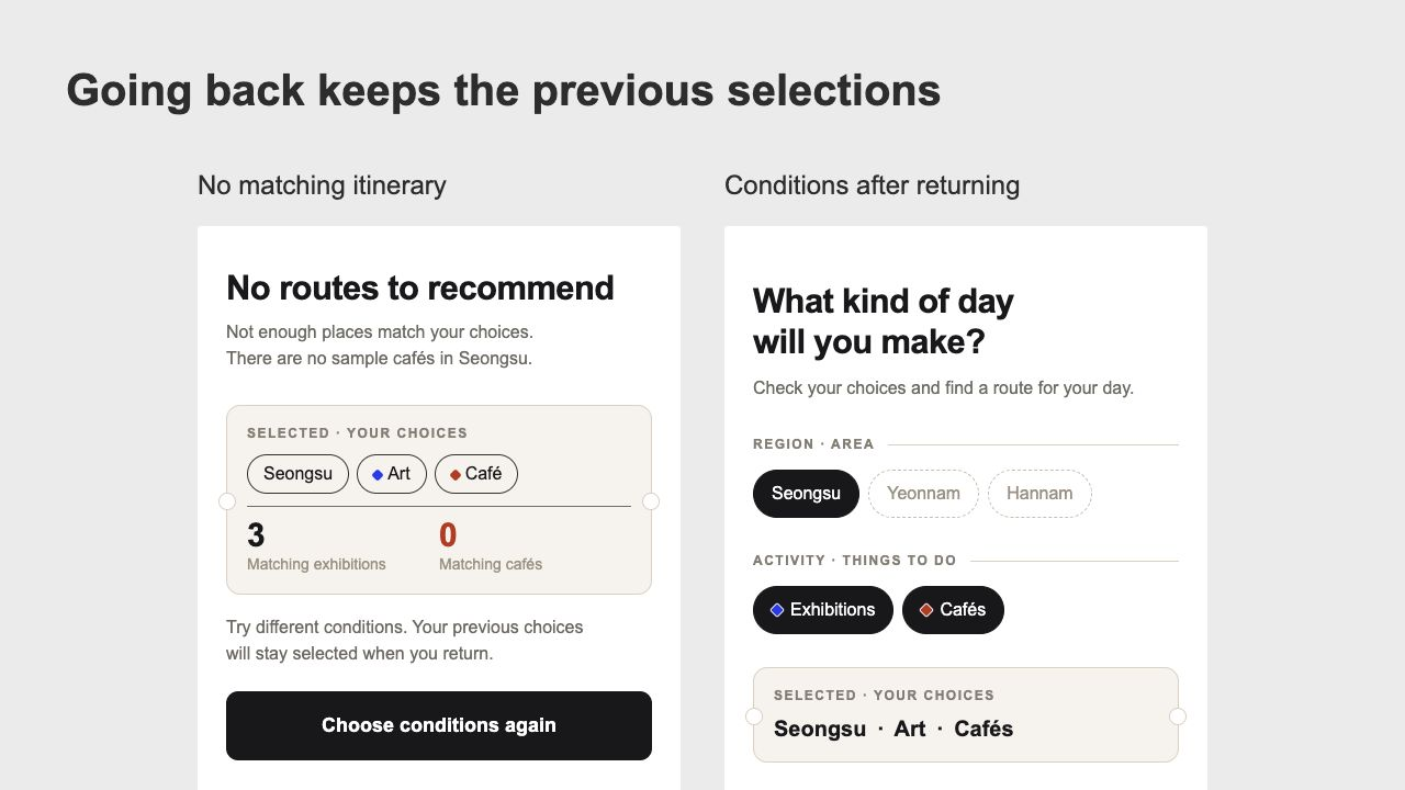
We had something concrete to show the next person
Here is what changed between the initial idea and the prototype.
Question or task | At the start | After this exercise |
|---|---|---|
Who is it for and why build it | One service-overview paragraph | A PRD |
What happens after an action | Notes across AI conversations | A feature specification with agreed rules |
How do the screens connect and what is on them | No layouts | One user flow and three wireframes |
What can we click and check | No implementation | A prototype that runs in a browser |
What is still outside this build | Not implemented | Real place data, a recommendation algorithm, saving, sharing, and login |
This was a prototype using sample data, not a finished service.
We had not tested it with users yet. But we could now check the recommendation path, the unavailable-result message, and whether choices stayed selected after going back.
A developer or designer could look at those screens with us.
We could discuss what belonged in the next build and why we had chosen particular behavior, instead of reconstructing the idea from scattered chats.
We could also show it to someone planning a day out.
Would they want to follow the route? What would they expect to do after being told there were no matching places?
Those responses could help us decide whether to gather more place data or build saving next.
That would be the next test, not a claim about this one.
If you have written a service overview, you already have somewhere to start.
Bring that paragraph into Manyfast and choose one action you want a user to try.
Decide what should appear after they take it.
That is a practical first step toward an app plan you can build from.